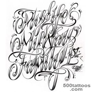
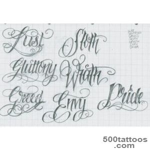
Lettering tattoos

Lettering tattoos are all about readable typography and meaningful words. The best designs balance the message with clean spacing and proportion. Good spacing is the difference between readable and cluttered text.
Pick the message
Short phrases, names, or single words are easier to read and age better. Focus on a message you will still value years from now. Avoid trendy slang if you want the text to feel timeless.
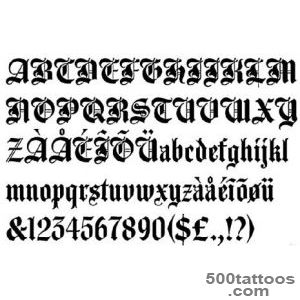
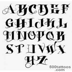
Font and readability
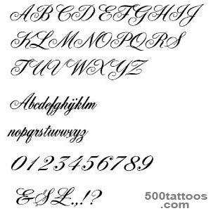
Script can look elegant but may blur if lines are too thin. Serif or block fonts are durable and clear, especially for longer phrases. Ask your artist to test the font at the exact size you plan to wear.
Placement and flow
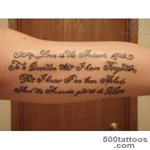
Forearm, ribcage, collarbone, and back are common because the text can follow a natural line. Make sure the curve of the body does not distort the words. A stencil on the body helps confirm spacing before any ink.
Size and spacing
Give letters enough room so the counters do not close over time. If the phrase is long, increase size or split it into two lines. If letters touch, they can blur into a single line over time.
Lettering tattoos designs and images