Hebrew tattoo

Hebrew tattoos draw from one of the oldest continuously used alphabets, and that history gives even a single word a weight that goes beyond decoration.
The script reads right to left, connects deeply to Jewish faith and Israeli identity, and has strict rules about letter spacing that affect how the tattoo ages.
Because mistakes in Hebrew are easy to make and hard to fix, preparation matters as much as artistry.
A well-executed Hebrew piece can honor a faith tradition or preserve a personal truth in a language that has survived millennia.
What drives people to choose Hebrew
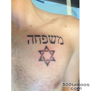
Heritage is the most common reason: people with Jewish roots use the script to carry their identity visibly.
Faith-based choices often feature short passages from the Torah, Psalms, or blessings that hold personal significance.
Some choose Hebrew for its visual character alone, drawn to the angular letterforms and the drama of right-to-left text.
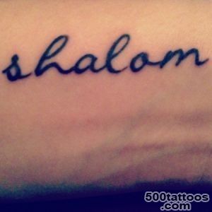
Others want a word like shalom, chai, or emunah because the concept feels more complete in its original language.
Whatever the motivation, the result needs to be linguistically accurate, because native readers will notice errors instantly.
Avoiding translation and spelling errors
Hebrew has vowel marks called nikkud that are usually omitted in everyday writing but can change pronunciation if used incorrectly.
If your phrase includes nikkud, have a fluent reader verify each mark, because a misplaced dot can alter the word entirely.
Online translation tools are especially unreliable for Hebrew because the language uses grammatical gender, and short phrases often lack enough context for accurate output.
Ask a native speaker to write your phrase by hand, photograph it, and compare it to the final stencil before the session begins.
If the word is sacred or liturgical, consider consulting a rabbi or scholar about appropriate use.
Lettering style and visual weight
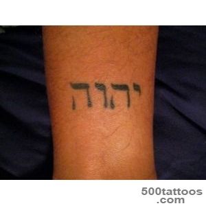
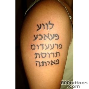
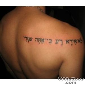
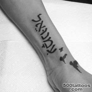
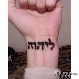
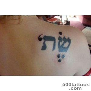
Block print, the style used in printed books and signage, is the most legible and the easiest for artists to replicate accurately.
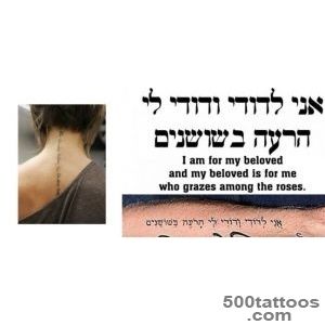
Cursive Hebrew looks elegant but introduces curves and connections that can blur at small sizes.
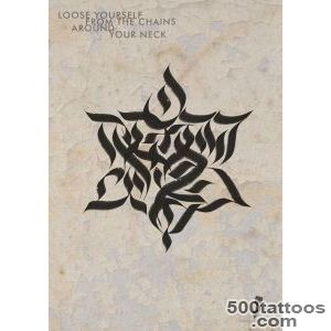
Decorative calligraphic styles add flair but should only be attempted by artists who have experience with right-to-left scripts.
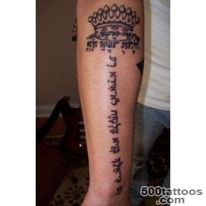
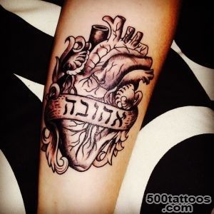
Keep ornamentation minimal so the letters remain the focal point, and avoid wrapping the text around curves that would force readers to rotate their view.
Placement for readability
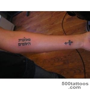
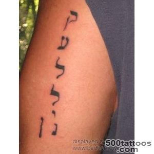
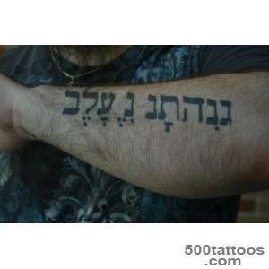
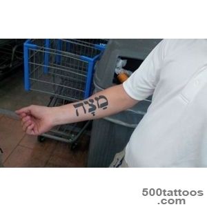
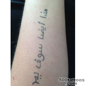
The inner forearm provides a flat, visible surface that suits a single word or short phrase read from wrist to elbow.
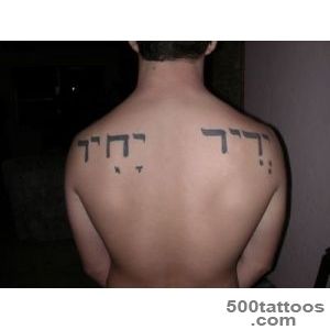
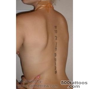
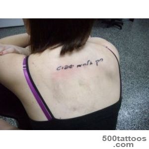
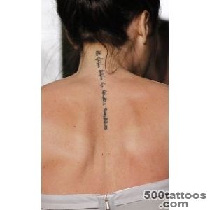
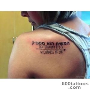
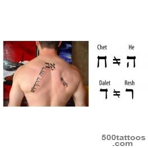
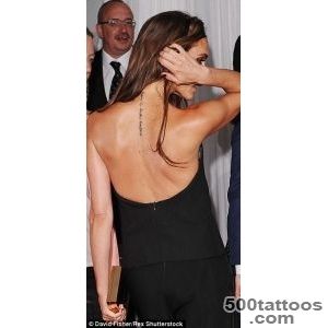
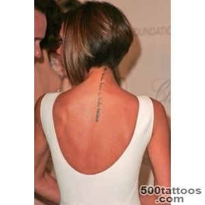
Upper arms and upper backs offer more room for longer passages, but the baseline must stay level.
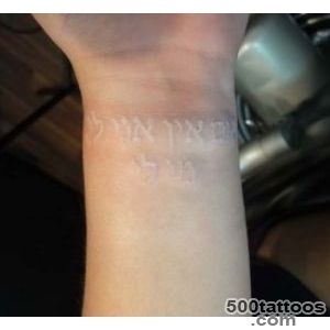
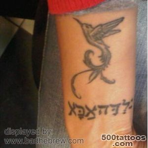
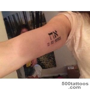
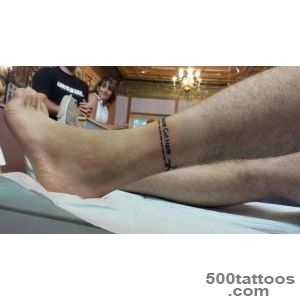
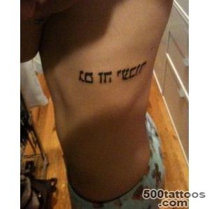
Very small placements like the wrist or behind the ear limit you to one or two words; anything longer risks becoming illegible within a few years.
Consider how the text will appear to other Hebrew readers; an upside-down or mirrored phrase is a visible mistake that undermines the meaning.
Caring for fine script tattoos
Hebrew letters rely on consistent stroke width, so careful healing is critical to preserve sharp edges.
Keep the area clean, dry, and out of direct sunlight for the first two weeks.
After healing, applying a thin layer of unscented lotion helps maintain contrast between the ink and your skin.
Plan a check-in with your artist after six months; fine script often needs a single pass to restore any letters that softened during the healing process.
