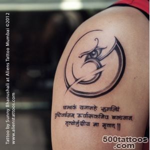
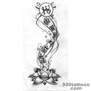
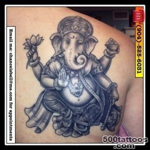
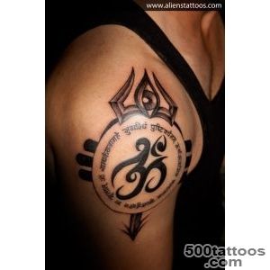
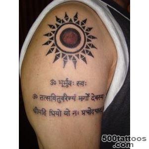
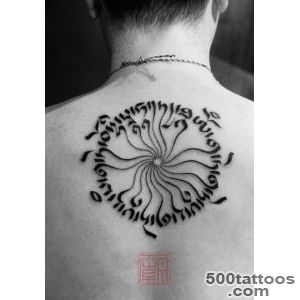
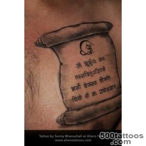
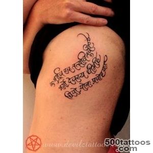
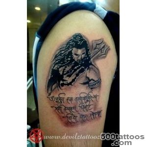
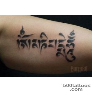
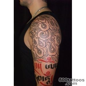
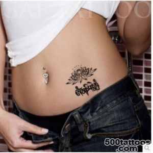
Mantra tattoo

A mantra tattoo is often a personal tool for focus, grounding, and self-talk, turning words into a daily practice. The meaning is simple but deep: a short phrase can hold your identity, values, and the mindset you want to return to under stress. Whether it comes from a spiritual tradition or from a line you wrote yourself, the power lies in choosing words that genuinely shift how you feel when you read them.
Choosing Words That Actually Matter
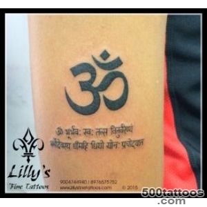
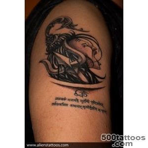
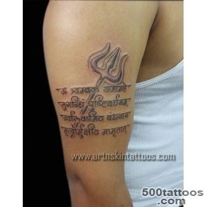
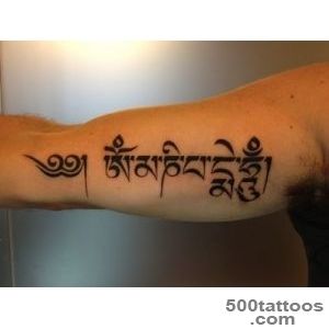
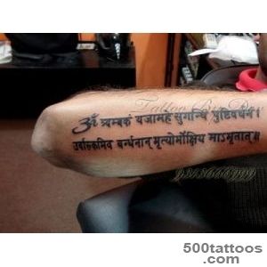
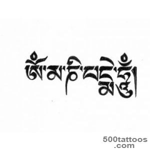
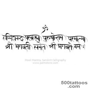
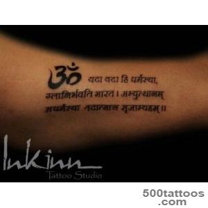
The strongest phrases tend to be short enough to absorb in a single glance, usually five to eight words. Some people choose Sanskrit or Pali lines from Buddhist and Hindu traditions, while others prefer a personal affirmation in their native language. The key is specificity: a vague positive statement fades into background noise, but a phrase tied to a real moment or decision keeps its charge for years.
Script Styles and Lettering Approaches
Fine-line script keeps a mantra subtle and elegant, while blackwork lettering makes it bold and highly readable. Watercolor can add a gentle wash behind the words, and realism can mimic brush strokes or textured ink for a more tactile feel. Handwritten fonts carry a personal warmth that print-style fonts cannot replicate, and mixing uppercase with lowercase can change the emotional tone entirely.
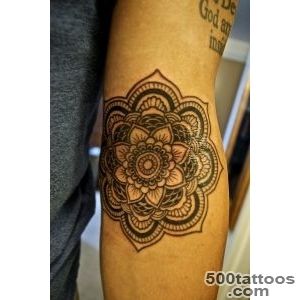
Placement for Daily Visibility
Many place a mantra on the wrist or inner forearm so it stays in sight when they need a reminder, while the upper arm and shoulder keep it more private. If the phrase is long, the forearm gives better spacing so letters do not crowd together. The ribcage and collarbone are also popular for mantras that are meant to be intimate rather than public, read only by the person who carries them.
Languages and Cultural Sensitivity
If you are choosing a phrase from a language you do not speak, triple-check the translation with a native speaker or a qualified scholar, not just an online tool. Misspelled Sanskrit or incorrectly transliterated Arabic is surprisingly common, and the error becomes permanent. A reputable artist will ask you to verify the text before the session begins.
Longevity and Care
Pick a size that keeps the script legible, expect the wrist to be more sensitive, and follow careful aftercare so the lettering heals crisp without spreading. Thin serifs and tiny dots are the first elements to blur over time, so discuss minimum stroke width with your artist and plan for a possible touch-up after five to seven years.
Mantra tattoo designs and images