Fonts tattoo

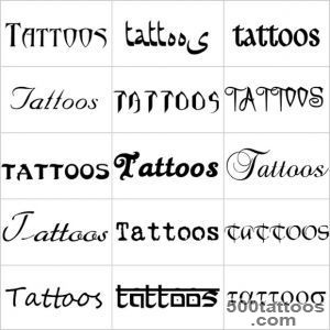
Choose the message first
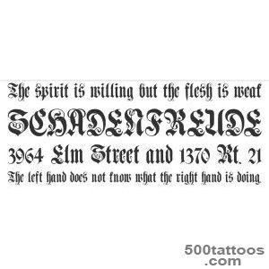
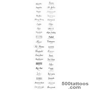
If you are leaning toward language and lettering, Latin phrases may help. Before picking a font, finalize your text. Keep it short-one word, a date, or a brief phrase works best. Long passages are hard to read on skin and rarely age well. The message should be meaningful enough that you can explain it in one sentence.
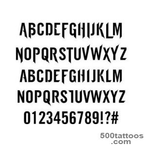
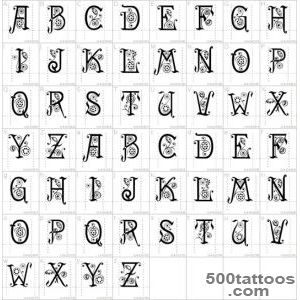
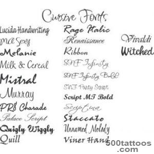
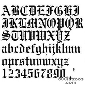
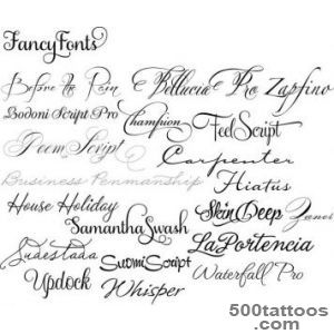
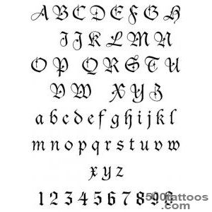
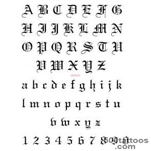
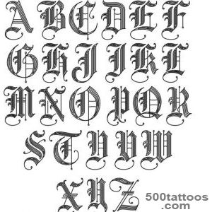
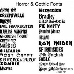
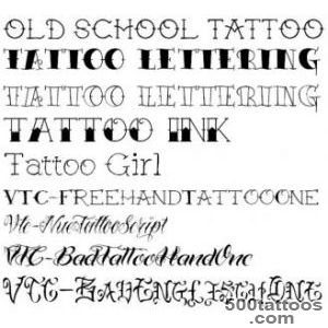
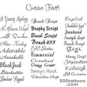
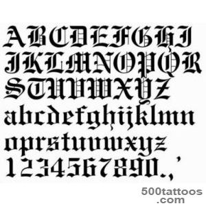
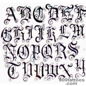
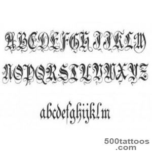
Font categories
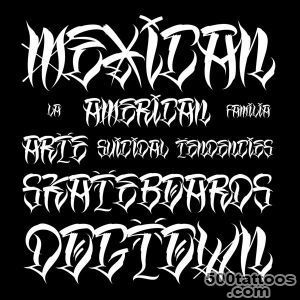
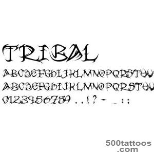
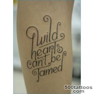
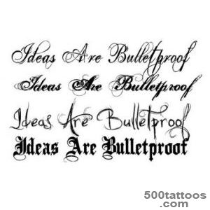
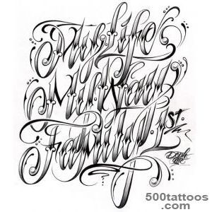
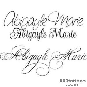
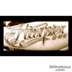
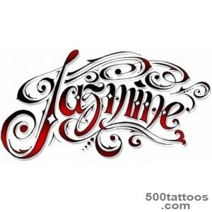
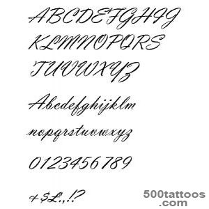
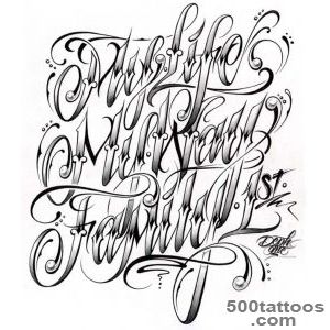
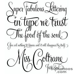
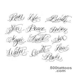
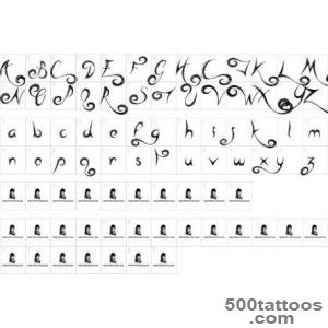
Script fonts (cursive, calligraphy) flow elegantly and suit names, words, and short phrases. Serif fonts (with decorative strokes) feel classic and formal. Sans-serif fonts feel modern and clean. Gothic and blackletter styles add weight and drama. Monoline fonts have consistent stroke width for a minimal look.
Readability rules
Thin letters can blur together over time. Choose fonts with adequate stroke weight for your size. Spacing between letters (kerning) matters-too tight and letters merge; too loose and words look disconnected. On curved placements, letters may distort, so adjust the design to follow your body.
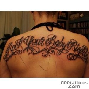
Placement strategy
Straight text fits best on flat areas: outer forearm, upper arm, upper back. Ribs and collarbone can hold curved or angled text. Finger and wrist placements work for very short text but demand simplified fonts. Match line length to body shape.
Proofing checklist
Before committing, verify: Is the spelling correct? Is the grammar accurate (especially for foreign languages)? Is the capitalization intentional? Does the punctuation look right? Have a second person check. Print the design at actual size and look at it from reading distance.
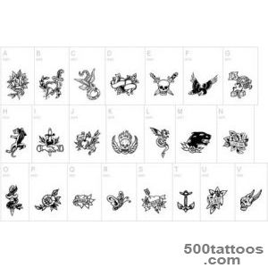
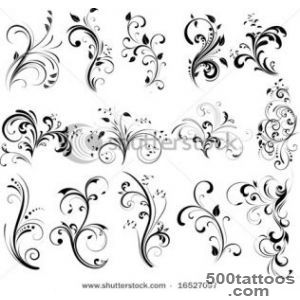
Fonts tattoo designs and images